> ## Documentation Index
> Fetch the complete documentation index at: https://docs.symmetry.com/llms.txt
> Use this file to discover all available pages before exploring further.
# Custom theming for embedded experiences
> Apply your branding to embedded Symmetry I-9 experiences. Covers the account and employer theme inheritance model, how it works, and the supported styling elements.
Symmetry I-9 supports custom theming for embedded experiences, allowing you to apply your branding to the user interfaces embedded within your platform. Theming applies to both embedded modules included with Symmetry I-9:
* **Employee embedded experience**: the interface end users complete to submit Form I-9
* **Administrator embedded experience**: the interface you use to review submissions and take action on E-Verify cases
Custom theming enables you to deliver a branded, cohesive experience across these embedded modules while preserving established UI behavior and accessibility standards.
## Theming scope and inheritance model
Symmetry I-9 supports a two-tier theming model that lets you manage branding at either the account (service provider) level or the employer level.
### Account-level themes
An account-level theme acts as the default theme for your account.
* When applied, the theme cascades to all employers under your account
* Updates and deletions at this level affect all employers
* Account-level `GET` operations return the theme from the first available employer domain
Use account-level theming when you want a consistent brand experience across all employers you manage.
### Employer-level themes
An employer-level theme applies only to a specific employer.
* Employer-level themes override any account-level theme for that employer
* Updates affect only the specified employer
* Other employers continue to use the account-level theme (if present) or their own employer-level theme
Use employer-level theming when you need employer-specific branding.
## How it works
Custom themes use a JSON configuration format that automatically translates into CSS variables applied globally across all application pages. The system uses nested JSON structures to organize style properties logically, making theme management straightforward and maintainable.
**Supported customization**
To ensure usability and visual consistency, only a defined set of styling properties can be modified.
Unsupported values may still be processed as CSS variables but do not affect rendered UI elements.
## Supported elements
Theming allows you to customize specific visual elements across six categories. These settings apply consistently across both embedded experiences.
### Body text and typography
Controls the default text styling `body` used throughout the embedded interfaces:
| Attribute | Type | Description |
| :--------- | :----- | :-------------------------------------------------------- |
| `fontSize` | string | Base font size for body text (for example,`15px`). |
| `color` | string | Base text color for body content. (for example,`#F54927`) |
### Links & navigation
Defines how links (`link)` appear and respond to user interaction:
| Attribute | Type | Description |
| :---------------- | :----- | :----------------------------------------------------------- |
| `color` | string | Default link color |
| `decoration` | string | Default text decoration (for example, `underline` or `none`) |
| `hoverColor` | string | Link color on hover |
| `hoverDecoration` | string | Hover text decoration |
### Headings (H1–H6)
Provides consistent styling for all heading levels in the `headings` object (`h1`, `h2`, `h3`, `h4`, `h5`, `h6`):
| Attribute | Type | Description |
| :----------- | :----- | :------------------------------ |
| `fontSize` | string | Font size for the heading level |
| `fontWeight` | string | Weight of the heading text |
| `color` | string | Color of the heading text |
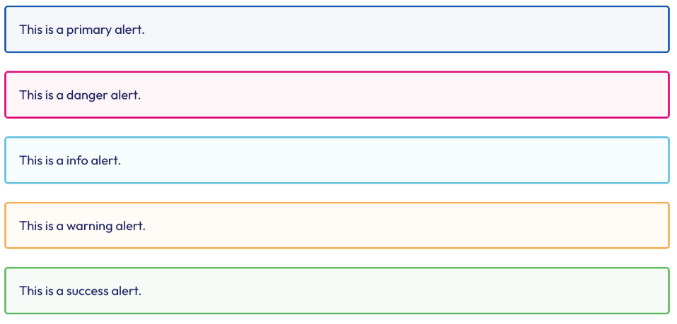
 ### Alerts & notifications
Customizes `alerts` and notifications using variant-based styling:
| Attribute | Type | Description |
| :------------------------- | :----- | :--------------------------------------------------------------------------------------------------------------- |
| `borderWidth` | string | Border thickness for alerts |
| `borderRadius` | string | Corner radius for alert containers |
| `variants` | object | Color and border settings for alert variants (possible values:`primary`, `info`, `danger`, `success`, `warning`) |
| `variants.backgroundColor` | string | Background color for the alert variant |
| `variants.borderColor` | string | Border color for the alert variant |
### Alerts & notifications
Customizes `alerts` and notifications using variant-based styling:
| Attribute | Type | Description |
| :------------------------- | :----- | :--------------------------------------------------------------------------------------------------------------- |
| `borderWidth` | string | Border thickness for alerts |
| `borderRadius` | string | Corner radius for alert containers |
| `variants` | object | Color and border settings for alert variants (possible values:`primary`, `info`, `danger`, `success`, `warning`) |
| `variants.backgroundColor` | string | Background color for the alert variant |
| `variants.borderColor` | string | Border color for the alert variant |
 ### Buttons & interactive elements
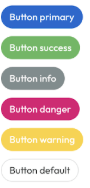
Controls the appearance of `buttons` across variants and states:
| Attribute | Type | Description |
| :------------------------------- | :----- | :---------------------------------------------------- |
| `borderRadius` | string | Button corner radius within alerts |
| `variants` | object | Per-variant button styling |
| `variants.backgroundColor` | string | Background color for the button |
| `variants.activeBackgroundColor` | string | Background color when the button is active or pressed |
| `default` | string | Border color used for the default button style |
### Buttons & interactive elements
Controls the appearance of `buttons` across variants and states:
| Attribute | Type | Description |
| :------------------------------- | :----- | :---------------------------------------------------- |
| `borderRadius` | string | Button corner radius within alerts |
| `variants` | object | Per-variant button styling |
| `variants.backgroundColor` | string | Background color for the button |
| `variants.activeBackgroundColor` | string | Background color when the button is active or pressed |
| `default` | string | Border color used for the default button style |
 ### Form controls & inputs
Ensures consistent styling for user input `formControl` elements:
| Attribute | Type | Description |
| :----------------- | :----- | :--------------------------------------------- |
| `borderColor` | string | Border color applied to inputs and form fields |
| `borderRadius` | string | Corner radius for form fields |
| `focusBorderColor` | string | Border color when a field is focused |
### Form controls & inputs
Ensures consistent styling for user input `formControl` elements:
| Attribute | Type | Description |
| :----------------- | :----- | :--------------------------------------------- |
| `borderColor` | string | Border color applied to inputs and form fields |
| `borderRadius` | string | Corner radius for form fields |
| `focusBorderColor` | string | Border color when a field is focused |